
Differential expression analysis
Last updated on 2026-10-06 | Edit this page
Overview
Questions
- How can we identify the differentially expressed proteins between our experimental groups?
Objectives
- Conduct differential expression analysis using
limpa - Visualise the top differentially expressed proteins
Differential Expression Analysis (DEA)
Now it is time to analyse our data and investigate proteins that are
differentially expressed between our two experimental groups (control vs
active Crohn’s disease). We will make use of the limma
package and closely related limpa functions specifically
designed for proteomics data.
First, we will fit a linear model that includes both Class and Batch effects.
R
# Set the control group as our reference
Class <- relevel(Class, ref = "Ctrl")
## We also need to reset our colors to match the correct labels
Class.color <- Class
levels(Class.color) <- hcl.colors(nlevels(Class), palette = "cividis")

# Fit a linear model
design <- model.matrix(~Class + Batch)
design
OUTPUT
   (Intercept) ClassaCD BatchB3
1            1        1       0
2            1        1       0
3            1        0       0
4            1        1       0
5            1        0       0
6            1        0       0
7            1        1       0
8            1        1       0
9            1        0       0
10           1        0       0
11           1        0       0
12           1        1       1
13           1        0       1
14           1        1       1
15           1        1       1
16           1        0       1
17           1        0       1
18           1        1       1
19           1        0       1
20           1        0       1
attr(,"assign")
[1] 0 1 2
attr(,"contrasts")
attr(,"contrasts")$Class
[1] "contr.treatment"

attr(,"contrasts")$Batch
[1] "contr.treatment"
We can see both Class and Batch accounted for in our design matrix.
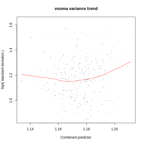
Now we run the limpa differential expression
analysis function dpcDE() to identify the top
differentially expressed proteins in our dataset.
R
fit <- dpcDE(y.protein, design, plot = TRUE)
R
fit <- eBayes(fit)

# Save our DEA results as a dataframe
results <- topTable(fit, coef = 2, number = Inf)
head(results, n=10)
OUTPUT
            Protein.Group   Genes NPrec   PropObs    logFC   AveExpr        t
PRTN3_HUMAN        P24158   PRTN3    11 0.5318182 4.466376 11.146376 6.909181
S10A9_HUMAN        P06702  S100A9    23 0.6086957 3.809772 12.809535 6.354521
S10A8_HUMAN        P05109  S100A8    17 0.6500000 3.811580 12.865666 6.070836
TRFL_HUMAN         P02788     LTF    46 0.3152174 3.998155  9.061431 5.755649
CEAM8_HUMAN        P31997 CEACAM8     6 0.3583333 3.130770 10.078482 5.689102
SAMP_HUMAN         P02743    APCS     8 0.5500000 2.720499 11.028982 5.317264
A1AG1_HUMAN        P02763    ORM1    11 0.4454545 3.349038 10.284907 5.228180
CAP7_HUMAN         P20160    AZU1     6 0.4666667 3.200935 10.422828 4.613159
FRIH_HUMAN         P02794    FTH1    12 0.5625000 2.528232 11.341144 4.227551
RNAS2_HUMAN        P10153  RNASE2     6 0.5666667 2.887344 11.228811 4.222031
                 P.Value    adj.P.Val         B
PRTN3_HUMAN 8.925010e-08 2.499003e-05 7.9144199
S10A9_HUMAN 4.259266e-07 5.962972e-05 6.4365520
S10A8_HUMAN 9.561952e-07 8.924488e-05 5.6692531
TRFL_HUMAN  2.361339e-06 1.601347e-04 4.8072662
CEAM8_HUMAN 2.859548e-06 1.601347e-04 4.6265892
SAMP_HUMAN  8.351415e-06 3.897327e-04 3.6089071
A1AG1_HUMAN 1.079883e-05 4.319532e-04 3.3650472
CAP7_HUMAN  6.335565e-05 2.217448e-03 1.6820936
FRIH_HUMAN  1.897372e-04 5.396097e-03 0.6493939
RNAS2_HUMAN 1.927177e-04 5.396097e-03 0.6366310A closer look at the results
Our output table is ordered by B statistic. Run
View(results) to take a closer look at some of the lower
ranked proteins.
Are there any proteins with an absolute fold change > 2 (|logFC| > 1) that are not statistically significant? Can you think of some explanations for this?
Hint: Take note of the PropObs value and remember its relationship to standard error.
Visualise differentially expressed proteins
Expression values and standard error by sample
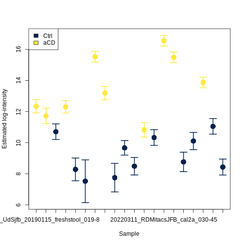
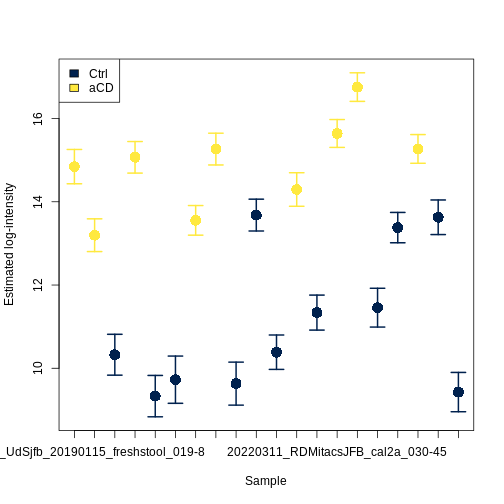
We can visualise the log2 expression values for individual proteins, together with standard errors.
R
plotProtein(y.protein, "PRTN3_HUMAN", col = as.character(Class.color))
legend('topleft', legend = levels(Class), fill = levels(Class.color))
R
plotProtein(y.protein, "S10A9_HUMAN", col = as.character(Class.color))
legend('topleft', legend = levels(Class), fill = levels(Class.color))
Challenge
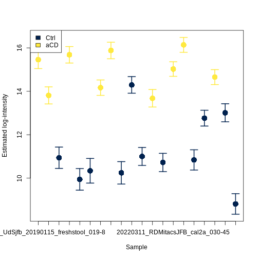
This simple function plots the protein values from our expression
matrix, which we did not directly edit to mitigate batch effects. Try
running the limma function to remove batch effects from our
dataset and see how this changes your plot.
R
y.protein.rbe <- y.protein
y.protein.rbe$E <- removeBatchEffect(y.protein,batch = y.protein$targets$Batch, group=y.protein$targets$Class)

plotProtein(y.protein.rbe, "S10A9_HUMAN", col = as.character(Class.color))
legend('topleft', legend = levels(Class), fill = levels(Class.color))
Heatmap
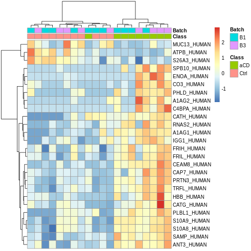
We can filter our results to the up to 50 top most significant differentially expressed proteins, then visualise via a clustered heatmap.
R
# Filter for the up to 50 most significant results
sig_proteins_df <- results %>%
  filter(adj.P.Val < 0.05) %>% # filter by p value
  top_n(50, wt = abs(logFC)) # filter by absolute log fold change

sig_proteins <- rownames(sig_proteins_df)
expr_matrix <- y.protein$E[sig_proteins, ]

# Scale the data and visualise via heatmap
scaled_expr <- t(scale(t(expr_matrix)))

pheatmap(scaled_expr,
         cluster_rows = TRUE,
         cluster_cols = TRUE,
         show_rownames = TRUE,
         show_colnames = FALSE,
         annotation_col = y.protein$targets,
         clustering_method = 'ward.D')
Challenge
How would you interpret this heatmap?
Volcano plot
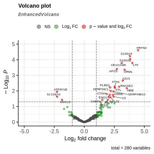
We can also visualise our results as a volcano plot using
EnhancedVolcano().
R
EnhancedVolcano(results,
                lab = results$Genes,
                x = 'logFC',
                y = 'adj.P.Val',
                pCutoff = 0.05,
                FCcutoff = 1.0,
                pointSize = 2.0,
                labSize = 3.5,
                drawConnectors = TRUE,
                maxoverlapsConnectors = Inf,
                lengthConnectors = unit(0.001, 'npc'),
                typeConnectors ='closed',
                ylim = c(0, 5),
                xlim = c(-5, 5))
- We can fit a linear model to our data and conduct differential
expression analysis using
limpaandlimmafunctions. - There are many different ways to visualise differentially expressed proteins.