
Multi-omics integration with DIABLO
Last updated on 2026-04-28 | Edit this page
Estimated time: 60 minutes
Overview
Questions
- How can we integrate microbiome and metabolomics data to identify shared biological signals?
- What does DIABLO do, and how is it different from single-omics analyses?
- How do we tune a multi-omics model and choose the number of components and selected features?
- How do we interpret DIABLO outputs to understand discriminative multi-omics signatures?
Objectives
- Preprocess microbiome and metabolomics data for multi-omics integration (filtering, transformation, normalisation).
- Perform unsupervised integration (sPLS) to explore cross-omics correlations.
- Train, tune, and validate a DIABLO model for classification.
- Interpret sample plots, feature correlations, loadings, and multi-omics signatures produced by DIABLO.
Author: Geraldine Kong
This workshop introduces multi-omics integration using DIABLO from mixOmics R package, adapted from mixOmics’ tutorial https://mixomics.org/mixdiablo/diablo-tcga-case-study/.
We will use the dataset from Franzosa et al. (2019) to integrate microbiome species profiles from shotgun metagenomics with metabolomics data. The goal is to identify a multi-omics signature that discriminates healthy controls from patients with Clostridium difficile (CD) by finding correlated and predictive features across the omics. You will learn how to tune the model, explore the relationships between features, and interpret sample groupings.
Setting up
First, load the required packages and the helper functions for data pre-processing.
R
library(mixOmics)
OUTPUT
Loading required package: MASSOUTPUT
Loading required package: latticeOUTPUT
Loading required package: ggplot2OUTPUT
Loaded mixOmics 6.34.0
Thank you for using mixOmics!
Tutorials: http://mixomics.org
Bookdown vignette: https://mixomicsteam.github.io/Bookdown
Questions, issues: Follow the prompts at http://mixomics.org/contact-us
Cite us:  citation('mixOmics')
R
# Prevalence filter function
## Usage example: filtered <- filter_prevalence(count_mat, min_prev = 0.20) # To filter features present in 20% of sample
## Samples as rows, Features as columns
filter_prev <- function(x, min_prev) {
  x <- as.matrix(x)
  if (!is.numeric(x)) {
    stop("Input data must be numeric (samples x features).")
  }

  # Calculate prevalence (number of non-zero values) per feature
  prev <- colSums(x > 0)
  n_samples <- nrow(x)

  # Convert proportion threshold to number of samples if needed
  if (min_prev < 1) {
    cutoff <- ceiling(min_prev * n_samples)
  } else {
    cutoff <- min_prev
  }

  # Keep only features meeting prevalence requirement
  keep <- prev >= cutoff

  # Display message
  message("Kept ", sum(keep), " / ", ncol(x),
          " features (", round(sum(keep) / ncol(x) * 100, 2), "%) ",
          "that are present in ≥ ", min_prev * 100, "% of all samples.")

  return(x[, keep, drop = FALSE])

}

# Abundance filter function
### threshold: proportion cutoff (0.001 = 0.1%)
### Samples as rows, Features as columns
filter_microb_abund <- function(x, threshold = 0.001) {
  x <- as.matrix(x)
  if (!is.numeric(x)) {
    stop("Input data must be numeric (samples x features).")
  }

  # total count across all samples
  total_counts <- sum(x)

  # total abundance per feature (column sums)
  feature_totals <- colSums(x)

  # proportion of total for each feature
  feature_prop <- feature_totals / total_counts

  # keep features ≥ threshold
  keep <- feature_prop >= threshold

  # Display message
  message("Kept ", sum(keep), " / ", ncol(x),
          " features (", round(sum(keep) / ncol(x) * 100, 2), "%) ",
          "with ≥ ", threshold * 100, "% total abundance")

  return(x[, keep, drop = FALSE])
}


# rCLR normalization function
### Samples as rows, Features as columns
rclr_norm <- function(x, pseudocount = 1, base = exp(1)) {
  x <- as.matrix(x)
  if (!is.numeric(x)) {
    stop("Input data must be numeric (samples x features).")
  }

  x <- x + pseudocount # add pseudocount to avoid log(0)

  lx <- log(x, base = base) # log-transform

  # robust center per sample (median of log-values)
  centers <- matrixStats::rowMedians(lx)

  # subtract median from each sample
  lx_centered <- sweep(lx, 1, centers, FUN = "-")

  return(lx_centered)
}

# Filter and transformation function for metabolomics data
### Samples as rows, features as columns
filter_metab_abund <- function(x, cutoff = 1000, min_prop = 0.7) {
  # Data: samples x features numeric matrix / data.frame
  # cutoff: intensity threshold

  if (!is.numeric(as.matrix(x))) {
    stop("Input x must be numeric (samples x features).")
  }

  keep <- apply(x, 2, function(x) mean(x > cutoff, na.rm = TRUE) >= min_prop)
  filtered <- x[, keep, drop = FALSE]

  attr(filtered, "removed_features") <- colnames(x)[!keep]
  attr(filtered, "kept_features") <- colnames(filtered)

  # Display message
  message("Kept ", sum(keep), " / ", ncol(x),
          " features (", round(sum(keep) / ncol(x) * 100, 2), "%) ",
          "that passed the threshold in ≥ ", min_prop * 100, "% of samples.")

  return(filtered)
}

# Transform metabolomics data
transform_metab <- function(x, pseudocount    = 1e-6, # constant added constant to avoid log(0)
                            center = FALSE, scale  = FALSE) {
  # metab: samples x features numeric matrix / data.frame

  # coerce to matrix and check
  x <- as.matrix(x)
  if (!is.numeric(x)) {
    stop("Input 'metab' must be numeric (samples x features).")
  }

  rn <- rownames(x)
  cn <- colnames(x)

  ## 1. Sample-wise median normalization (PQN-like)
  metab_norm <- t(apply(x, 1, function(x) x / stats::median(x, na.rm = TRUE)))

  ## 2. Log10 transform
  metab_log <- log10(metab_norm + pseudocount)

  ## 3. Autoscaling (mean-center + unit variance by default)
  metab_scaled <- scale(metab_log, center = center, scale = scale)

  # restore dimnames
  rownames(metab_scaled) <- rn
  colnames(metab_scaled) <- cn

  return(metab_scaled)
}
Next, load the Franzosa2019 dataset and inspect the R objects. The data has 144 samples: 56 Controls and 88 CD cases, stored in an R list object containing the following:
metadata: 144 rows (samples) with 7 columns (sample metadata)
microbiome: 144 rows (samples) with 55882 columns (bacterial species)
metabolome: 144 rows (samples) with 367 columns (metabolites)
R
data_int <- readRDS('data/Franzosa_IBD_2019.RDS')

# Inspect
lapply(data_int, dim)
OUTPUT
$metadata
[1] 144   7

$microbiome
[1]   144 55882

$metabolome
[1] 144 367
R
## You can view each object in Rstudio using View(data_int$metadata)

# Save to each object name
meta <- data_int$metadata
metab <- data_int$metabolome
microb <- data_int$microbiome

# Number of samples in each group
table(meta$Group)
OUTPUT
     CD Control
     88      56
R
# Check that the samples are in the same order across all datasets
table(rownames(microb) == meta$Sample)
OUTPUT
TRUE
 144
R
table(rownames(metab) == meta$Sample)
OUTPUT
TRUE
 144
Microbiome data pre-processing
Filter the data
Features that are rare or with low abundance should be filtered out prior to analysis to remove noise from the data. Here we are filtering out microbiome features that are NOT present in more than 50% of the samples, AND have less than 0.1% overall abundance.
R
# Filter based on prevalence
## Drop rare features that are not present in more than 50% of the samples
microb_filt <- filter_prev(microb, min_prev = 0.5) # 50% of samples, or 70%
OUTPUT
Kept 5664 / 55882 features (10.14%) that are present in ≥ 50% of all samples.R
# Filter based on relative abundance
## Drop features that have total of < 0.1%
microb_filt_0.1 <- filter_microb_abund(microb_filt, threshold = 0.001)
OUTPUT
Kept 188 / 5664 features (3.32%) with ≥ 0.1% total abundanceTransform the data
Data should be normalised and transformed prior to integration. Here we apply the robust centered log-ratio transformation (rCLR) method for microbiome data which is less sensitive to extreme values than the standard CLR. A small pseudocount is added prior to rCLR transformation to avoid log(0).
R
# rCLR transform data
microb_rclr <- rclr_norm(microb_filt_0.1, pseudocount = 1)
dim(microb_rclr)
OUTPUT
[1] 144 188Cleanup names
Because the original microbiome features contain the full taxonomic lineage (very long names), the code below shortens them to species names only.
R
head(colnames(microb_rclr))
OUTPUT
[1] "d__Bacteria;p__Firmicutes_A;c__Clostridia;o__Lachnospirales;f__Lachnospiraceae;g__Fusicatenibacter;s__Fusicatenibacter saccharivorans"
[2] "d__Bacteria;p__Verrucomicrobiota;c__Verrucomicrobiae;o__Verrucomicrobiales;f__Akkermansiaceae;g__Akkermansia;s__Akkermansia muciniphila_A"
[3] "d__Bacteria;p__Bacteroidota;c__Bacteroidia;o__Bacteroidales;f__Tannerellaceae;g__Parabacteroides;s__Parabacteroides goldsteinii"
[4] "d__Bacteria;p__Firmicutes_A;c__Clostridia;o__Lachnospirales;f__Lachnospiraceae;g__Blautia_A;s__Blautia_A faecis"
[5] "d__Bacteria;p__Firmicutes_A;c__Clostridia;o__Lachnospirales;f__Lachnospiraceae;g__Anaerostipes;s__Anaerostipes hadrus_A"
[6] "d__Bacteria;p__Firmicutes_A;c__Clostridia;o__Oscillospirales;f__Ruminococcaceae;g__Gemmiger;s__Gemmiger qucibialis"
R
# Shorten species names
colnames(microb_rclr) <- sapply(colnames(microb_rclr), function(x){
  strsplit(x, split = ';')[[1]][7]
})
colnames(microb_rclr) <- gsub("s__", "", colnames(microb_rclr))

# New names
head(colnames(microb_rclr))
OUTPUT
    d__Bacteria;p__Firmicutes_A;c__Clostridia;o__Lachnospirales;f__Lachnospiraceae;g__Fusicatenibacter;s__Fusicatenibacter saccharivorans
                                                                                                        "Fusicatenibacter saccharivorans"
d__Bacteria;p__Verrucomicrobiota;c__Verrucomicrobiae;o__Verrucomicrobiales;f__Akkermansiaceae;g__Akkermansia;s__Akkermansia muciniphila_A
                                                                                                              "Akkermansia muciniphila_A"
          d__Bacteria;p__Bacteroidota;c__Bacteroidia;o__Bacteroidales;f__Tannerellaceae;g__Parabacteroides;s__Parabacteroides goldsteinii
                                                                                                            "Parabacteroides goldsteinii"
                          d__Bacteria;p__Firmicutes_A;c__Clostridia;o__Lachnospirales;f__Lachnospiraceae;g__Blautia_A;s__Blautia_A faecis
                                                                                                                       "Blautia_A faecis"
                  d__Bacteria;p__Firmicutes_A;c__Clostridia;o__Lachnospirales;f__Lachnospiraceae;g__Anaerostipes;s__Anaerostipes hadrus_A
                                                                                                                  "Anaerostipes hadrus_A"
                       d__Bacteria;p__Firmicutes_A;c__Clostridia;o__Oscillospirales;f__Ruminococcaceae;g__Gemmiger;s__Gemmiger qucibialis
                                                                                                                    "Gemmiger qucibialis"
Metabolome data pre-processing
Filter the data
Similar to above, metabolome features that are rare should be removed. Here, we are filtering out metabolites which are NOT present in more than 50% of the samples.
R
metab_filt <- filter_metab_abund(x = metab, cutoff = 100, min_prop = 0.5)
OUTPUT
Kept 217 / 367 features (59.13%) that passed the threshold in ≥ 50% of samples.Initial analysis: Unsupervised integration using PLS
Before training DIABLO, it is important to explore the datasets separately (e.g., PCA, sPLS-DA) and perform unsupervised integration (e.g., rCCA or sPLS) to understand correlation structure.
Here we use sPLS and request 25 variables from each dataset (arbitrary) that maximise covariance between microbiome and metabolome.
R
# select the number of features to keep in the model
list.keepX = c(25, 25)
list.keepY = c(25, 25)

# run sPLS
spls_res <- spls(microb_rclr, metab_log,
             keepX = list.keepX, keepY = list.keepY,
             scale = T)
The correlation circle plot below is a good starting point to visualise the correlations between the selected features for each component, here showing features with |correlation| above 0.5. Points that cluster together are positively associated with each other, whereas points that are on the opposite end are negatively associated with each other.
There is a cluster of microbiome features that are positively correlated with metabolome features on the first component (purple and green dots on the right side of the plot), with a small selection of metabolome with opposite correlations (green dots on the left side of the plot). There is also a cluster of microbiome features that have a contribution towards Component 2, with only 1 (out of the 25) top metabolome features that have some sort of correlative relationship between the two.
R
# plot features of first PLS
plotVar(spls_res, cutoff = 0.5, title = "(a) microbiome vs metabolomics",
        legend = c("microbiome", "metabolomics"),
        var.names = FALSE, style = 'graphics',
        pch = c(16, 17), cex = c(2,2),
        col = c('darkorchid', 'lightgreen'))

Below shows the correlation between the top 25 microbiome and metabolome features, with the rows corresponding to microbiome Component 1 and 2, and columns corresponding to metabolomics Component 1 and 2. The first component from the microbiome data shows a very strong correlation (~0.9) with the first component from the metabolomics data, while the other components show much weaker correlations. This suggests that most of the shared signal between the two datasets is captured by the first component.
R
# calculate correlation of microbiome and metabolomics
cors <- cor(spls_res$variates$X, spls_res$variates$Y)

rownames(cors) <- paste0("microb_comp", 1:nrow(cors))
colnames(cors) <- paste0("metab_comp", 1:ncol(cors))

cors
OUTPUT
             metab_comp1   metab_comp2
microb_comp1  0.89514137 -2.100475e-17
microb_comp2  0.02162159  7.082259e-01
DIABLO integration
Setup: Split train and test data
To evaluate the ability of DIABLO to generalise the signatures to new datasets, we are using 80% of data (115 samples) to train the DIABLO model to learn discriminative features, and assessing the performance of the model on the remaining 20% of the data (29 samples).
R
set.seed(123)   # reproducible
index <- sample(1:nrow(microb_rclr), size = 0.8 * nrow(microb_rclr))

# Separate training / testing data
## Microbiome
train_microb <- microb_rclr[index, ]
test_microb  <- microb_rclr[-index, ]

## Metabolomics
train_metab <- metab_log[index, ]
test_metab <- metab_log[-index, ]

## Metadata
train_meta <- meta[index,]
test_meta <- meta[-index,]

# Put data in list
data_diablo = list(microb = train_microb,
                   metab = train_metab)
Setup: Design for DIABLO
DIABLO requires a design matrix (0-1 scale), which represents the strength of the relationship to be modeled between two given dataframes. Values close to 1 prioritise maximising correlations between the datasets; values close to 0 prioritise the discriminative ability of the model. Since predictive ability of the model is desired here, we use a design matrix of 0.1.
R
## Setup design
design <- matrix(0.1, ncol = length(data_diablo), nrow = length(data_diablo),
                dimnames = list(names(data_diablo), names(data_diablo)))
diag(design) <- 0
design
OUTPUT
       microb metab
microb    0.0   0.1
metab     0.1   0.0
With a design in place, the initial DIABLO model can be fitted using an arbitrary number of components (ncomp = 5) before tuning.
R
# form basic DIABLO model
basic.diablo.model = block.splsda(X = data_diablo, Y = train_meta$Group, ncomp = 5, design = design)
OUTPUT
Design matrix has changed to include Y; each block will be
            linked to Y.
Tuning parameters
Number of components
To choose the number of components for the final DIABLO model, the
function perf() is run with 10-fold cross-validation
repeated 10 times, computing performance for each omics block
separately.
In the case where you have small number of samples (n < ~10/group), you can use the ‘LOO’ (Leave-one-out) cross-validation method.
R
# Tune number of components
perf.diablo = perf(basic.diablo.model, validation = 'Mfold',
                   folds = 10, nrepeat = 10)

perf.diablo$error.rate
OUTPUT
$microb
       max.dist centroids.dist mahalanobis.dist
comp1 0.1173913      0.1208696        0.1208696
comp2 0.1191304      0.1217391        0.1191304
comp3 0.1339130      0.1182609        0.1260870
comp4 0.1443478      0.1252174        0.1434783
comp5 0.1434783      0.1252174        0.1434783

$metab
       max.dist centroids.dist mahalanobis.dist
comp1 0.1704348      0.1921739        0.1921739
comp2 0.1530435      0.1521739        0.1539130
comp3 0.1278261      0.1452174        0.1295652
comp4 0.1321739      0.1504348        0.1408696
comp5 0.1286957      0.1469565        0.1295652
The above shows the cross-validated error rates for the microbiome and metabolomics blocks across 1–5 components, evaluated under three different prediction distance metrics (max.dist, centroids.dist, mahalanobis.dist). Lower values indicate better classification performance.
We focus on the centroids.dist as it is a metric that is
stable with high-dimensional omics and robust when classes are
imbalanced, so it typically gives the most reliable and interpretable
performance estimates.
For the microbiome block: The error rate reduces slightly moving from Component 1 to Component 2. Increasing the number of components (Components 3–5) give only marginal further reductions.
For the metabolome block: Component 1 performs weakest. Increasing to Component 2 improve performance, with the best at Component 3. After Component 3, error does not continue decreasing — Components 4–5 fluctuate slightly, meaning no reliable gain.
The performance plateaus after Component 2–3, and later components provide negligible improvement.
You can visualize the error rates across the datasets as below.
R
plot(perf.diablo) # plot output of tuning
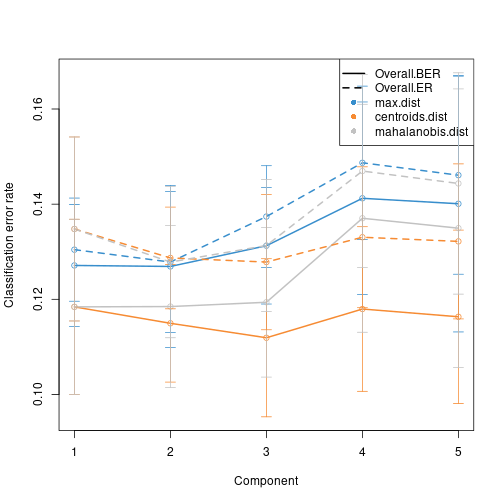
Centroids distance: First, for each of the classes,
the centroid is calculated using all the training samples associated
with that class. The Euclidean distance of the test sample to the
centroid of training samples are calculated. The class (outcome) will be
assigned to that sample based on whichever class centroid is closest to
that sample. Classifications made using this metric are less susceptible
to outliers within the training set. This metric is best used when the
classes cluster moderately well - which can be determined by plotting
the samples via the plotIndiv() function.
BER: Average misclassification rate across all classes. It is a metric that gives equal weight to each class, regardless of how many samples are in each class. Perfect prediction will give a BER of 0, whereas a random chance prediction will have BER of 0.5 (for 2 classes (or worse for more classes). Higher values indicates worse performance, whereas lower values indicates better performance.
In DIABLO tuning, adding components is stopped when additional components do not reduce BER in a consistent and meaningful way. Hence, in this case, the tuning results suggest that 1 component is enough to discriminate between the groups. This can occur when a dataset has strong discrminative signals.
WeightedVote.error.rate: Prediction is based on a weighted vote across components, where early components get more weight (because they usually capture more discriminative signal). This tends to work well when signal strength is concentrated in the first component.
Note: For visualisations (e.g, sample plots), a minimum of 2
components is required. In such cases, set ncomp = 2 in the
final DIABLO model, but interpret the biology primarily using features
from Component 1.
R
perf.diablo$choice.ncomp$WeightedVote
OUTPUT
            max.dist centroids.dist mahalanobis.dist
Overall.ER         1              1                1
Overall.BER        1              1                1
R
# Set ncomp = 2 for visualisation
ncomp = 2 # else perf.diablo$choice.ncomp$WeightedVote["Overall.BER", "centroids.dist"]
Number of features
DIABLO performs sparse variable selection, retaining only the top
number of features in each block with highest covariance while
maximising discrimination. To find the optimal number of features to
select in each dataset , you can use
tune.block.splsda().
Below, we set a range of values to test for the function to test iteratively to find the right number of features with the least error rate (from 5 to 10, and then incrementally by 2 until 20, and then incrementally by 5 until 30). You can set different ranges for the different datasets You can also identify the optimal number of features to select based on previous exploration of each omics data using sPLS-DA.
In this step, DIABLO evaluates each candidate number of selected
features using internal cross-validation. For every fold, the model
predicts class membership using the centroid-distance rule
(dist = "centroids.dist"), and the feature subset that
gives the lowest cross-validated error is retained as the optimal
keepX.
Here, this is tuned with 10-fold cross validation, but repeated only
once because of time constraints. In practice, a more thorough
tuning process (with increased nrepeat argument) is
recommended. The features are selected based on the centroids
dists, on the internal Mfold validation.
R
# *Can take awhile to run
# set grid of values for each component to test
test.keepX = list (microb = c(5:9, seq(10, 18, 2), seq(20,30,5)),
                   metab = c(5:9, seq(10, 18, 2), seq(20,30,5)))

tune.diablo = tune.block.splsda(X = data_diablo,
                                Y = train_meta$Group, ncomp = 2,
                              test.keepX = test.keepX, design = design,
                              validation = 'Mfold', folds = 10, nrepeat = 1,
                              dist = "centroids.dist")
OUTPUT
Design matrix has changed to include Y; each block will be
            linked to Y.
OUTPUT
You have provided a sequence of keepX of length: 13 for block microb and 13 for block metab.
This results in 169 models being fitted for each component and each nrepeat, this may take some time to run, be patient!
OUTPUT
You can look into the 'BPPARAM' argument to speed up computation time.The final number of optimal features selected are as below, first and second number for each block corresponding to Component 1 and 2 respectively:
R
list.keepX = tune.diablo$choice.keepX # set the optimal values of features to retain
list.keepX
OUTPUT
$microb
[1] 18  5

$metab
[1]  6 10
Final DIABLO model
We then run the final DIABLO model using the parameters from above. A warning message is expected: DIABLO automatically includes the outcome in the design so that each block’s component is associated with the group outcome.
R
final.diablo.model = block.splsda(X = data_diablo,
                                  Y = train_meta$Group,
                                  ncomp = ncomp,
                                  keepX = list.keepX, design = design)
OUTPUT
Design matrix has changed to include Y; each block will be
            linked to Y.
Visualisation
Sample plots
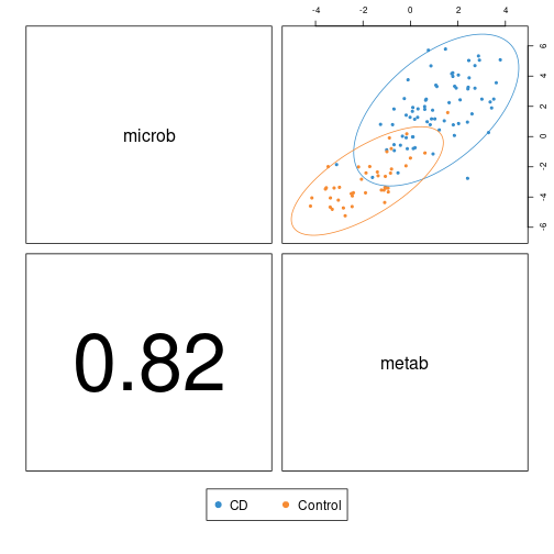
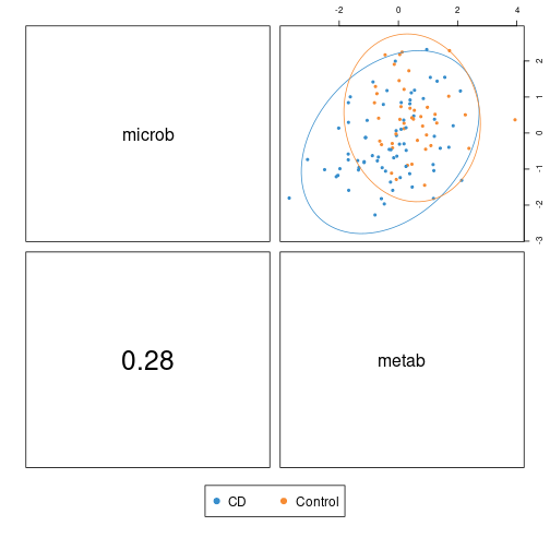
The plot below from plotDiablo() is a diagnostic plot
that shows how strongly the components extracted from each block are
correlated, as specified by the design matrix. The ncomp
argument selects which component is shown.
As you can see from the figures below, the first components of the microbiome and metabolome block are highly correlated to each other (indicated by the large correlation value shown in the bottom left). The colours and ellipses related to the sample subtypes indicate the discriminative power of each component to separate controls from CD.
- On Component 1: the group centroids are clearly separated although the confidence ellipses overlap moderately.
- On Component 2: the confidence ellipses overlap substantially, suggesting little additional discriminative signal beyond the first component
R
plotDiablo(final.diablo.model, ncomp = 1)
R
plotDiablo(final.diablo.model, ncomp = 2)
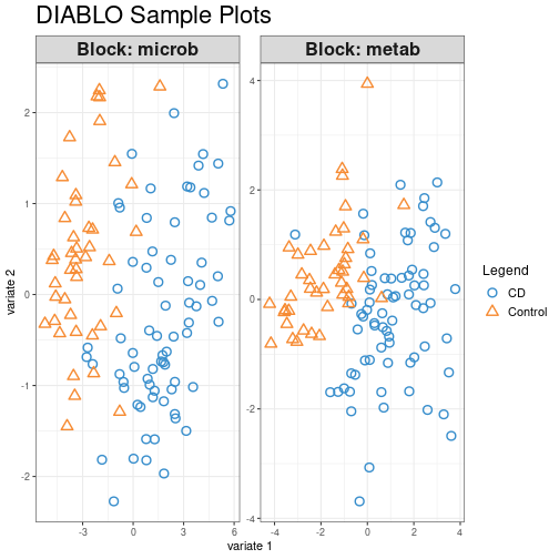
The sample plot below from plotIndiv() function projects
each sample into the latent space of each block, allowing visual
assessment of clustering patterns. Clustering of the samples can be
better assessed with this plot. Here, we can see that both datasets show
comparable separation of controls vs CD, suggesting that discriminatory
information is present in both omics.
R
plotIndiv(final.diablo.model, ind.names = FALSE, legend = TRUE,
          title = 'DIABLO Sample Plots')
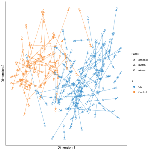
The plot below is an arrow plot from plotArrow()
function, showing per-sample agreement across datasets. Short, aligned
arrows imply high agreement across omics; longer or diverging arrows
indicate disagreement.
R
plotArrow(final.diablo.model, ind.names = FALSE, legend = TRUE,
          title = 'DIABLO')
Variable plots
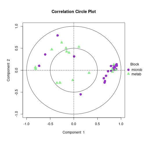
The correlation circle plot below shows the relationship between the selected features and their respective components.
On Component 1, a group of microbiome features is positively associated with a set of metabolite features, while another smaller subset of metabolites shows opposite correlations.
On Component 2, a small number of metabolome features correlate with microbiome, however, as shown above, those features are not important in discriminating between the groups so they can be ignored in the interpretation.
R
plotVar(final.diablo.model, var.names = FALSE,
        style = 'graphics', legend = TRUE,
        pch = c(16, 17), cex = c(1.5,1.5),
        col = c('darkorchid', 'lightgreen'))
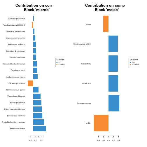
You can visualize the loading weights of each selected variable on
each component and each data set using plotLoadings().
Colours represent the group in which the feature shows the highest
expression (contrib = 'max') using the median
(method = 'median').
R
plotLoadings(final.diablo.model, comp = 1,
             contrib = 'max', method = 'median')
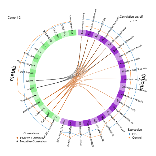
The circos plot below visualises pairwise correlations between
selected variables from different omics, represented on the side
quadrants. Here, we are visualizing correlations with at least a
strength of 0.7 (cutoff parameter), depicted by the lines
in the center. The outer most ring indicates the block membership and
group-specific expression levels (Control and CD).
R
circosPlot(final.diablo.model, cutoff = 0.7, line = TRUE,
           color.blocks= c('darkorchid', 'lightgreen'),
           color.cor = c("chocolate3","grey20"), size.labels = 1.5, size.variables = 0.6)
The clustered image map (CIM) below is a heatmap of the values of selected multi-omics signature across samples. By default, Euclidean distance and Complete linkage methods are used.
R
# *Can run into "figure margins too large" error
cimDiablo(final.diablo.model,margins = c(8, 8))
OUTPUT
trimming values to [-3, 3] range for cim visualisation. See 'trim' arg in ?cimDiablo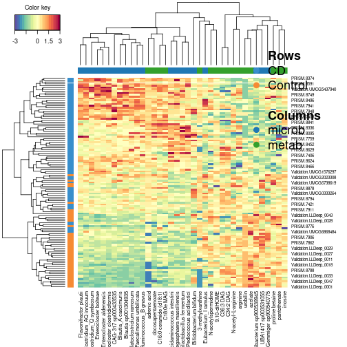
Evaluate model performance
To assess the performance of the model, we use the
perf() function to perform 10-fold cross-validation
repeated 10 times. In each cross-validation round, for each block in the
DIABLO model, a predicted class is obtained for every test sample. These
block-specific predictions are then combined to produce a single final
prediction per sample, which is used to compute the different error-rate
metrics.
MajorityVote: Each block contributes one class vote. The predicted class for a sample is simply the class receiving the highest number of votes across blocks.
Example: with three omics blocks and classes A and B, if the block-level predictions for a sample are A, A, B, the MajorityVote result for that sample is A.
WeightedVote: Each block casts a class vote, but votes are multiplied by block-specific weights that reflect the correlation between the block’s latent component and the outcome. The class whose votes sum to the highest weighted total becomes the predicted class.
Example: Using the previous block-level predictions (A, A, B) and block weights 0.3, 0.2, and 0.7, the weighted votes for class A total 0.3 + 0.2 = 0.5, and the weighted vote for class B is 0.7. Therefore, the WeightedVote result for that sample is B.
R
# *Can take awhile to run
# run repeated CV performance evaluation
perf.diablo = perf(final.diablo.model, validation = 'Mfold',
                   M = 10, nrepeat = 10,
                   dist = 'centroids.dist')

perf.diablo$MajorityVote.error.rate
OUTPUT
$centroids.dist
                comp1     comp2
CD          0.2305556 0.2180556
Control     0.1581395 0.1697674
Overall.ER  0.2034783 0.2000000
Overall.BER 0.1943475 0.1939115
R
perf.diablo$WeightedPredict.error.rate
OUTPUT
                comp1     comp2
CD          0.1194444 0.1541667
Control     0.1325581 0.1534884
Overall.ER  0.1243478 0.1539130
Overall.BER 0.1260013 0.1538275
From the results above, it can be seen that the error rate is quite low across the board, suggesting good classification performance. Let’s try the model on the test set to see how good it is at classifying novel samples.
Prediction on test set
We now test the model on the held-out samples using the
predict() function.
R
data_test = list(microb = test_microb,
                 metab = test_metab)

predict_diablo = predict(final.diablo.model, newdata = data_test)
To inspect the model’s prediction accuracy, we are using a confusion matrix.
A confusion matrix is a table that compares a model’s predicted labels with the true labels in a classification problem. It tells you not just how many predictions were wrong, but which classes were confused with each other. This is especially important when:
- Accuracy alone hides which groups perform poorly
- Some classes are harder to classify than others
- There is class imbalance
High diagonal values indicate good agreement between predicted and true labels.
R
confusion.mat = get.confusion_matrix(truth = test_meta$Group,
                                     predicted = predict_diablo$WeightedVote$centroids.dist[,2])
confusion.mat
OUTPUT
        predicted.as.CD predicted.as.Control
CD                   14                    2
Control               2                   11
The balanced error rate (BER) remains low, confirming that the DIABLO signature generalises well to the unseen test samples and performs similarly across both classes.
R
get.BER(confusion.mat)
OUTPUT
[1] 0.1394231- DIABLO integrates multiple omics datasets by identifying correlated and discriminative features across blocks.
- Proper filtering and transformation of each omics dataset are essential for stable multi-omics models.
- Tuning (components and keepX) guides the selection of the most predictive and biologically relevant features.
- DIABLO visualisations (sample plots, arrow plots, circos, CIM) reveal relationships across omics and help interpret multi-omics signatures.